
RangeFlow: Drag Your Dates
Building RangeFlow, a date range picker with a draggable, resizable range and a faster way to choose dates.
This post started from this post by kvnkld on X (Twitter).
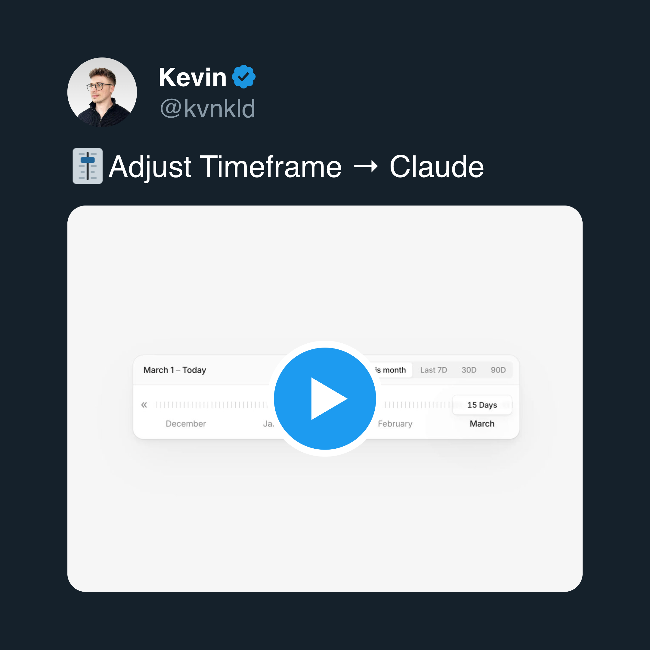
A few weeks ago, I was scrolling Twitter when I saw an idea for date range selection. Instead of using a calendar and clicking multiple times to define a range, the idea suggested using a slider that you can drag and resize to reach the time span you want.
I liked the idea right away. Here is the video that explains the core concept:
The Problem with Current Date Pickers
Most date range pickers have weak UX.
They are not difficult to use, but they are inefficient in real situations. This becomes obvious when you are booking flights or hotels.
You select a start date, then an end date, confirm the selection, and wait for the system to reload results. If the results are not what you want, you repeat the whole process. This becomes even more frustrating when you are selecting longer ranges such as multiple weeks.
I have never liked this flow.
When I saw that tweet, I decided to build the idea and use it in one of my own projects.
From Idea to Library
After a few days of building, it felt good enough to keep going.
I cleaned up the API, made the component more flexible, and turned it into an open source package.
That is how RangeFlow was created.
It is a small library, but it is meant to be flexible and extensible.
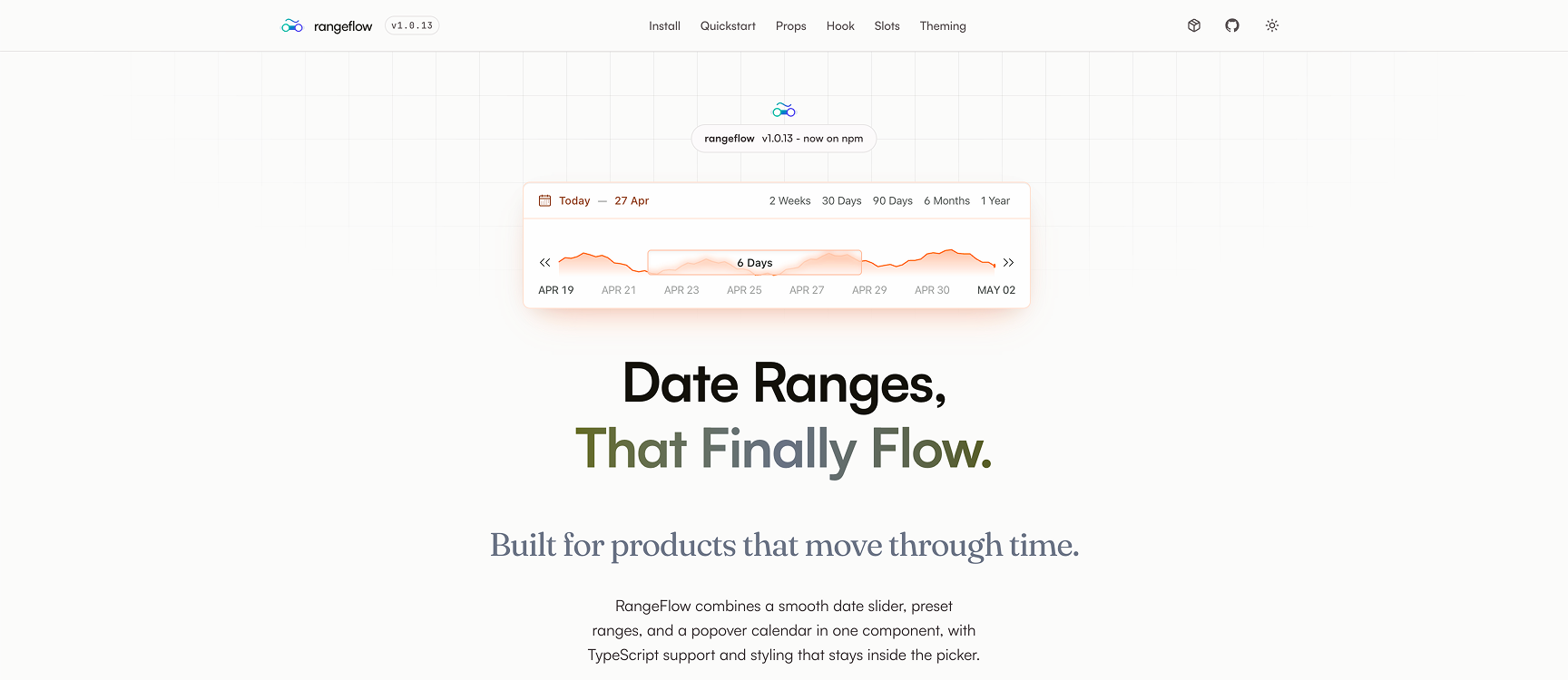
Demo and documentation are available here:
https://rangeflow.raminmousavi.dev
Source code:
https://github.com/raminious/rangeflow
What RangeFlow Does
RangeFlow is still a date range picker, but it changes the interaction model.
Instead of clicking through a calendar, users can drag a slider and resize it to define a range. The interaction is continuous and immediate.
While interacting with the range, the component can also display data. This can be a simple chart, a heatmap, or any custom visualization. The goal is to make the picker more informative instead of leaving it as a simple input.
import { RangeFlow, useRangeFlow } from 'rangeflow'
import 'rangeflow/style.css'

export function DatePicker() {
  return (
    <RangeFlow
      defaultRange={defaultRange}
      defaultSelected={defaultSelected}
      onChange={handleDateChange}
    />
  )
}
Supporting Both Interaction Models
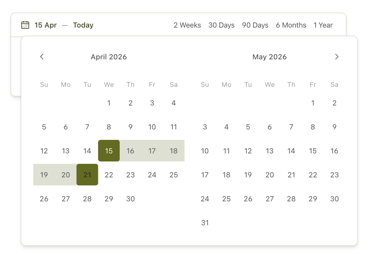
Some users are used to traditional date pickers, and ignoring that would be a mistake.
So I added a fallback. When the user clicks the selected range, a classic calendar picker opens. This lets users switch between the slider interaction and the traditional calendar when they need to.
Customization
RangeFlow is designed to be customized.
You can apply your own theme, override internal slots, and inject custom components into different parts of the UI.
For example, the ticker behind the slider does not have to be static. You can render a chart, a heatmap, or any React component there. That makes the component easier to adapt to different use cases.
Built-in Features
The library includes a solid set of built-in features:
- Drag-based range slider
- Quick range tabs
- Popover calendar fallback
- Min and max selection duration
- Disabled date boundaries
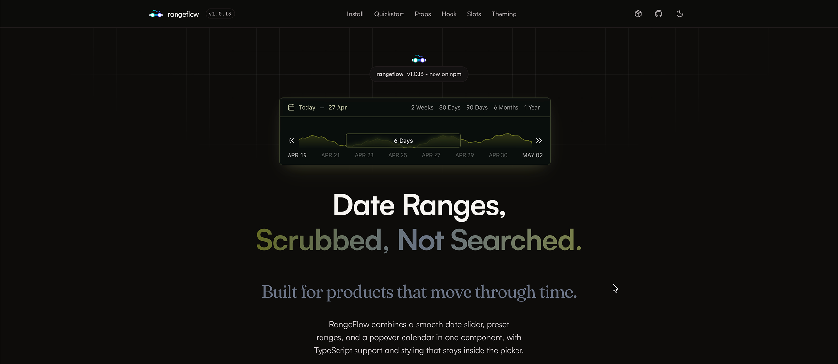
- CSS-variable theming with dark mode support
- Slot-based customization
- Imperative API for external control
These features are built around the slider model, so they still feel like part of the same component instead of a set of unrelated add-ons.
External Control with useRangeFlow
RangeFlow provides a hook called useRangeFlow that allows external control over the component.
This makes it possible to synchronize the picker with other parts of the application and update the range programmatically. It follows a pattern similar to libraries such as react-hook-form, where control is not limited to the component itself.
import { RangeFlow, useRangeFlow } from 'rangeflow'
import 'rangeflow/style.css'

export function DatePicker() {
  const api = useRangeFlow()

  return (
    <div>
      <Button
        onClick={() => {
          api.updateSelectedDates({
            from: dayjs().subtract(1, 'day').startOf('day').toDate(),
            to: dayjs().endOf('day').toDate()
          })
        }}
      >
        Yesterday and Today
      </Button>

      <RangeFlow
        api={api}
        defaultRange={defaultRange}
        defaultSelected={defaultSelected}
        onChange={handleDateChange}
      />
    </div>
  )
}
Implementation Details
Here is the current stack:
Styling is done with Tailwind. This was my first serious experience with it. State management is handled with Zustand. The slider interaction is built with dnd-kit and react-resizable-panels. The calendar fallback is powered by react-day-picker.
This setup comes with trade-offs.
Using both dnd-kit and react-resizable-panels increases bundle size. In an ideal scenario, I would build a custom solution for this part. Because of time constraints, I chose to move forward with existing tools. I plan to revisit this and likely rewrite the slider logic.
The Main Challenge
The hardest part of the implementation was synchronizing the slider with the calendar.
react-resizable-panels is not designed for date logic, so I had to adapt it for this use case. That introduced challenges around mapping pixel values to dates, keeping the slider and calendar in sync, and updating state correctly during drag and resize operations.
If you are interested in those details, the source code is worth exploring.
About useRangeFlow()
The useRangeFlow() hook allows external access to the internal state.
It can be used outside the RangeFlow component to control the picker. This makes the component more flexible and easier to integrate into complex applications.
The implementation can be found here: github/rangeflow/.../use-rangeflow.ts
Closing
This project started as a small experiment. It also highlighted a bigger issue: date range picking has not evolved much in terms of UX. RangeFlow is my attempt to rethink that interaction.
It is not perfect, and some parts still need improvement, but it is already usable. If you decide to use it, let me know. If you find issues or limitations, I would rather hear about them directly.
Rarely, but worth it
A short note whenever I publish something new.
Plus one newsletter-only post each month.